YOU WILL LEARN
✓
Mobile shows any page at phone width
✓
The switch shows the phone menu open
✓
Choose Mobile in Style to change phones only
Many of your customers will find you on a phone. Here you see your pages as they do, check the menu, and fix anything that gets in their way. A change you make for phones leaves the computer version as it was.
In the screenshots, Petal Street, a flower studio in Pune, checks its Wedding Flowers page.
See the phone layout
You don't need a phone to check. At the top of the website builder, three buttons show your page at different screen sizes: Desktop, Tablet and Mobile.
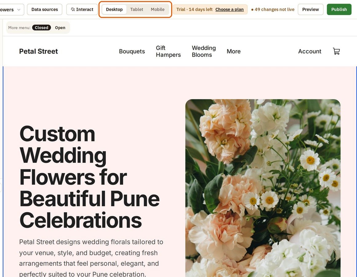
Press Mobile. The page narrows to the width of a phone. Opmiz rearranges it for you: the menu folds into three lines, and the photo moves below the words.
Check the menu
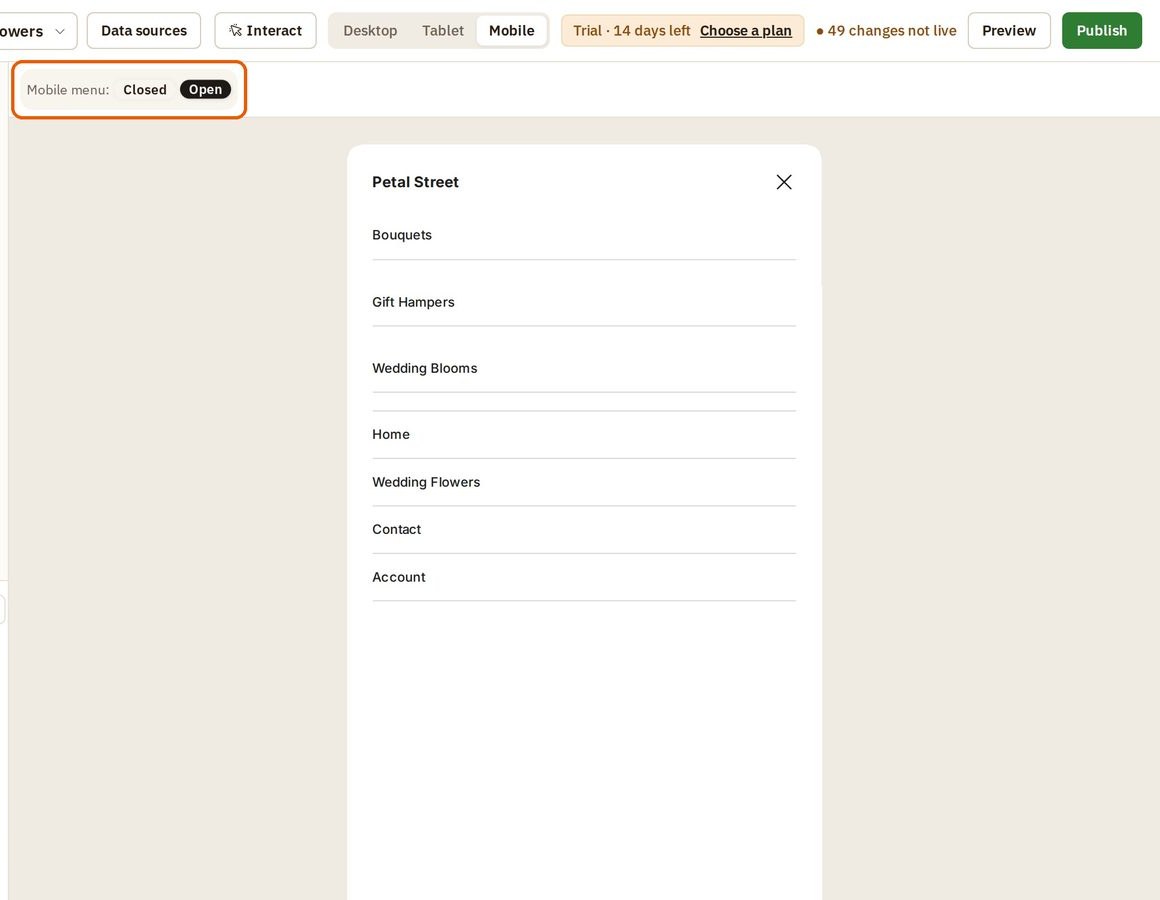
You can't tap the three lines in the builder. Instead, the Mobile menu switch above the page opens the menu for you.
- Press Open. This is what a customer sees when they tap the three lines.
- Make sure what matters most is easy to find.
- Press Closed to put the menu away.
A change for phones only
On a phone, Petal Street's main photo fills most of the screen, so people scroll a long way to reach anything below it. Here it is made shorter, on phones only.
- Click the photo, then press Style on its toolbar.
- Press More options. It opens every setting.
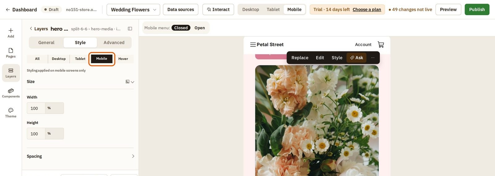
- Choose Mobile in the row of screen sizes. This is the important part: whatever you change next applies on phones only. The panel says Styling applied on mobile screens only.
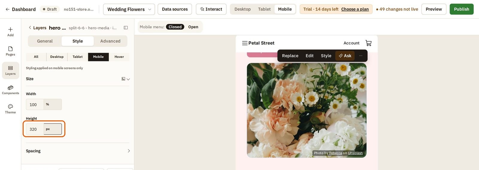
- Set the Height to 320 pixels (px).
The photo is shorter, and the rest of your page moves up.
Now press Desktop. Here the photo is as tall as it was. Only phones got the change.
Check your other pages
Do the same for each page. Stay on Mobile and pick the next page from the page list at the top of the builder. Read each one as a customer would:
- Are the words easy to read?
- Is the button easy to reach?
Once you have published, open your site on your own phone too.
Was this tutorial helpful?
AI websites with native commerce. Pages, blog, store, payments and GST invoices in one place, built from a short description.
Start free for 14 days →© 2026 Opmiz · WriterBabu Online Services Private Limited. All rights reserved.
Prices in INR, before 18% GST · Made in Patna, India